The Stories Behind the World’s Most Recognizable Luxury Signatures




According to branding experts, distinctive visual assets are among the most valuable forms of intellectual property a luxuryLuxuryA lifestyle defined by exceptional quality, craftsmanship, exclusivity, and sophistication, encompassing the finest products, services, and experiences that represent the highest standards of refinement and excellence.Go to Luxury Glossary house can possess. Unlike advertising campaigns, which fade with time, a signature color or pattern compounds in value with every generation of customers who learns to recognize it, transforming simple visual cues into multibillion-dollar brand assets. They demonstrate one of luxury’s greatest achievements: creating an identity so distinctive that a single shade or pattern can evoke an entire world, communicating heritage, craftsmanship, and aspiration instantly.
Hermès Orange: An Accident That Became Iconic
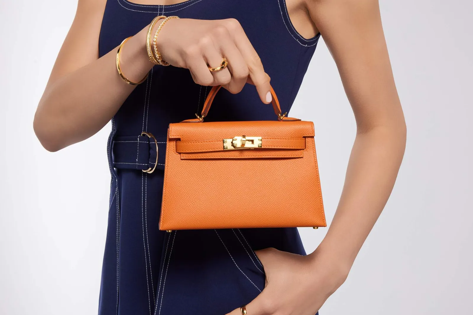
Before the Second World War, Hermès packaged its creations in cream-colored boxes trimmed with gold. During World War II, shortages of packaging materials forced Hermès to accept whatever boxes were available. The only available stock happened to be a vivid orange.
Unlike seasonal packaging adopted by many brands, Hermès has remained faithful to its signature orange for decades. It demonstrates an enduring principle of luxury branding: consistency creates memory.
Tiffany Blue: The Color That Began With the Blue Book
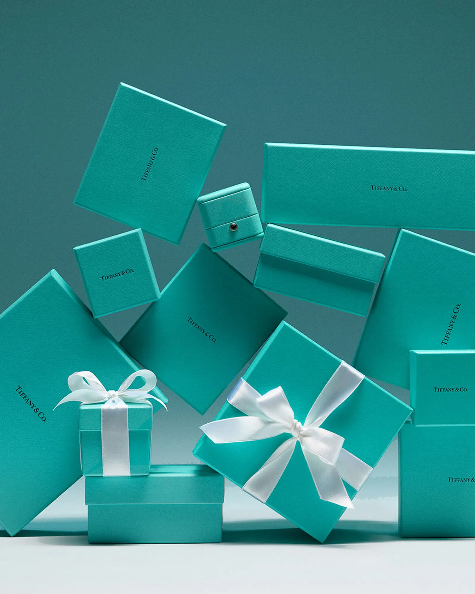
Before Tiffany & Co. became synonymous with engagement rings, Charles Lewis Tiffany had already established the color that would define the house. The now-famous robin’s-egg blue first appeared on the cover of the company’s Blue Book in 1845, one of America’s earliest luxuryLuxuryA lifestyle defined by exceptional quality, craftsmanship, exclusivity, and sophistication, encompassing the finest products, services, and experiences that represent the highest standards of refinement and excellence.Go to Luxury Glossary mail-order catalogs. Turquoise gemstones were fashionable among Victorian society, making the delicate blue an elegant choice for the publication.
The color eventually became so closely associated with Tiffany that it received its own proprietary designation—Tiffany Blue—and is legally protected as one of luxuryLuxuryA lifestyle defined by exceptional quality, craftsmanship, exclusivity, and sophistication, encompassing the finest products, services, and experiences that represent the highest standards of refinement and excellence.Go to Luxury Glossary’s most famous trademarks.
Cartier Panther: A Symbol of the Maison
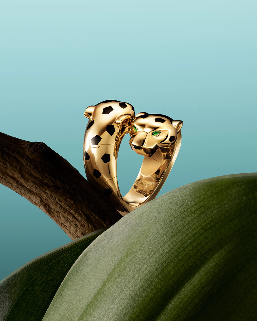
The panther motif traces its origins to 1914, when Cartier incorporated a stylized panther pattern into a ladies’ wristwatch. A few years later, Jeanne Toussaint—who would eventually become the house’s legendary Creative Director and was affectionately nicknamed “La Panthère”—transformed the feline into Cartier’s defining artistic symbol.
Under her direction, the panther evolved from an abstract motif into sculptural brooches, bracelets, rings, necklaces, and watches. Today, the Cartier Panther stands alongside the Tank and Love collections as one of the house’s most recognizable creations.
Chanel Camellia: Coco Chanel’s Favorite Flower

The camellia first captivated Coco Chanel for its perfect symmetry and understated elegance. Unlike roses or lilies, it is almost scentless, allowing it to symbolize beauty without excess, a philosophy that closely mirrored her own approach to design.
The bloom began appearing in Chanel’s couture creations during the 1920s before expanding into brooches, handbags, watches, fine jewelry, cosmetics, and fragrance packaging. Over time, it evolved into one of the house’s most enduring visual signatures.

Unlike the famous interlocking double-C logo, the camellia rarely serves as overt branding. Instead, it functions as a subtle reference appreciated by those familiar with the maison’s history.
Christian Louboutin Red: One Brushstroke Changed Fashion
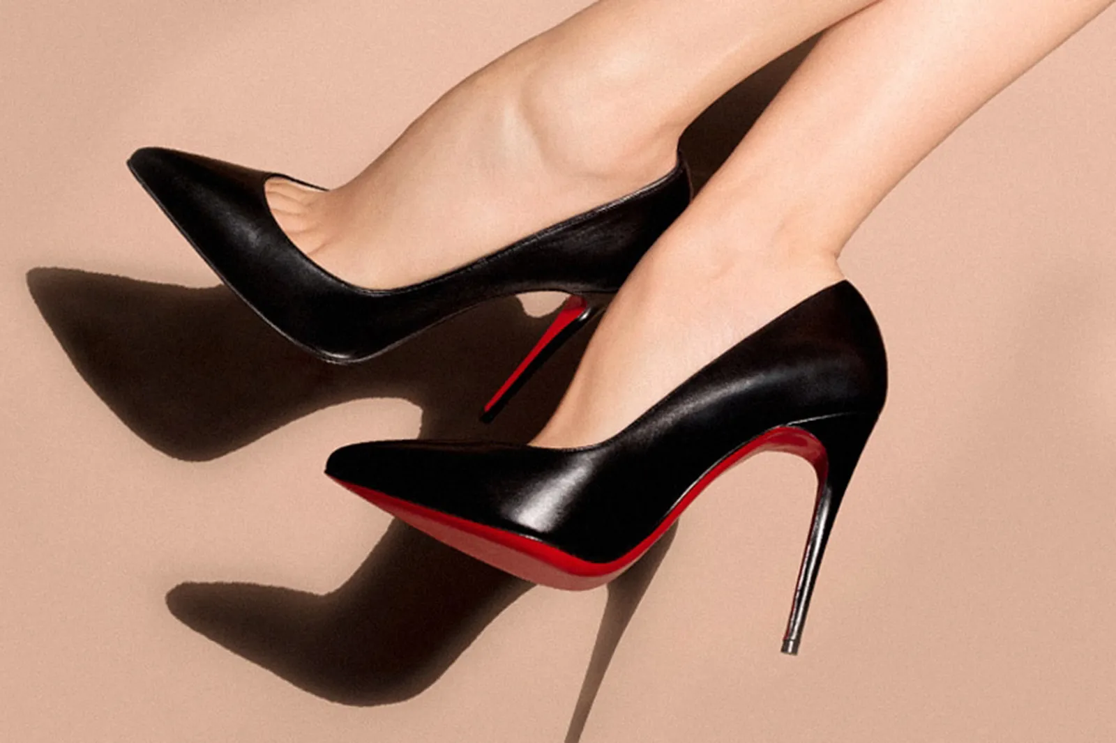
In 1992, while reviewing a prototype shoe, Louboutin felt something was missing. Nearby, an assistant happened to be painting her fingernails bright red. He borrowed the bottle and painted the shoe’s sole.
The vivid underside transformed the pump into something unmistakable. A fleeting glimpse of the sole identified the wearer before the shoe itself came into view.
The signature would eventually become the subject of one of fashion’s most closely watched trademark disputes, reinforcing that in luxury, color can become intellectual property.
Ferrari Rosso Corsa: Italy’s Racing Red

Rosso Corsa, or Racing Red, originated in the early twentieth century when international motorsport assigned national racing colors to competing countries. Italy received red, Britain green, Germany white before silver, and France blue.
As Ferrari emerged as Italy’s dominant racing manufacturer, Rosso Corsa gradually became inseparable from the marque itself—even if Enzo Ferrari actually preferred yellow for his cars.
Although modern Ferraris are available in hundreds of bespoke shades through the Tailor Made program, Rosso Corsa remains the emotional choice for collectors. It recalls Formula One victories, Le Mans triumphs, and generations of Italian engineering excellence.
Schiaparelli’s Shocking Pink
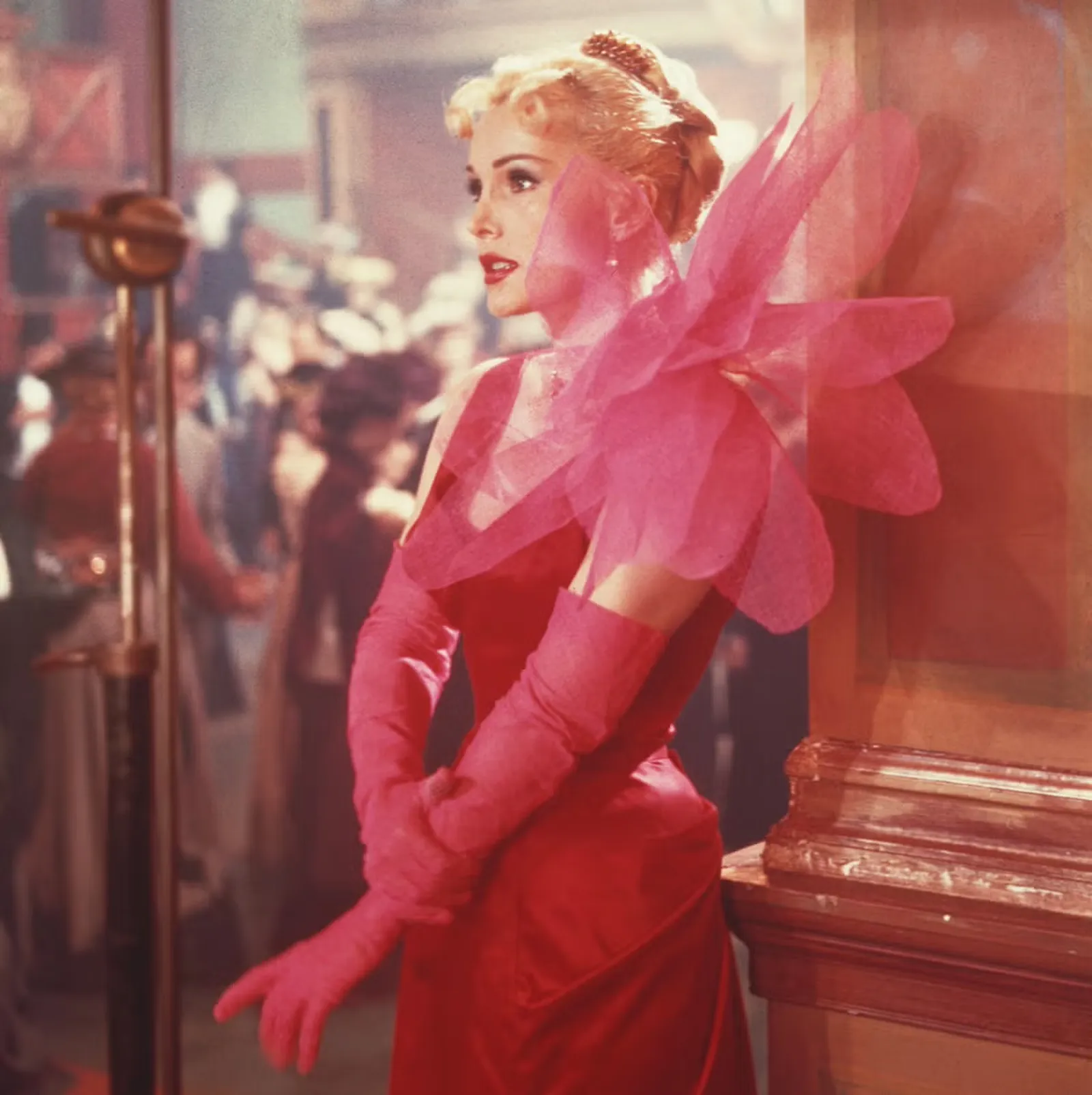
In 1937, Elsa Schiaparelli introduced Shocking Pink alongside the launch of her fragrance Shocking. Inspired by Surrealism and intended to provoke, the hue stood in direct contrast to the restrained palettes favored by traditional couture houses. The color became the visual expression of her fearless imagination, and continues to define the house even today.
Burberry Check: From Coat Lining to Cultural Symbol
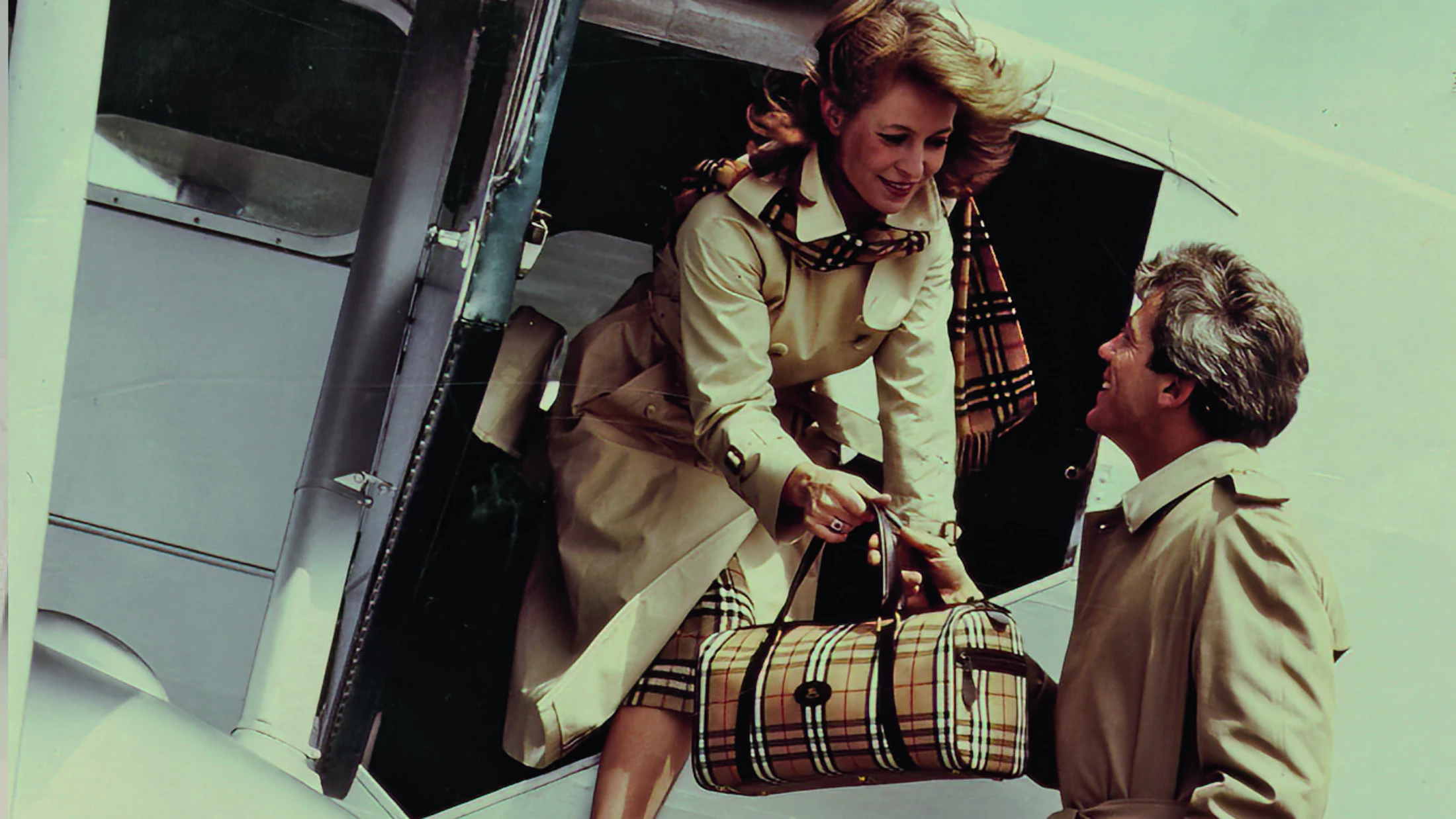
Burberry’s signature check first appeared during the 1920s as the lining inside the brand’s gabardine trench coats. The beige background crossed by black, white, and red stripes remained largely hidden, a discreet flourish for those who owned the garment.
Eventually, customers wanted the check to become visible. Scarves, umbrellas, and luggage adopted the motif. By the late twentieth century, the Burberry Check had become one of the world’s most recognizable patterns.
Heavy counterfeiting and overexposure temporarily diluted its exclusivity during the early 2000s. Through disciplined creative direction and careful repositioning, Burberry subsequently reasserted the check within a more controlled luxuryLuxuryA lifestyle defined by exceptional quality, craftsmanship, exclusivity, and sophistication, encompassing the finest products, services, and experiences that represent the highest standards of refinement and excellence.Go to Luxury Glossary context.
Louis Vuitton Monogram: Designed to Defeat Counterfeiters
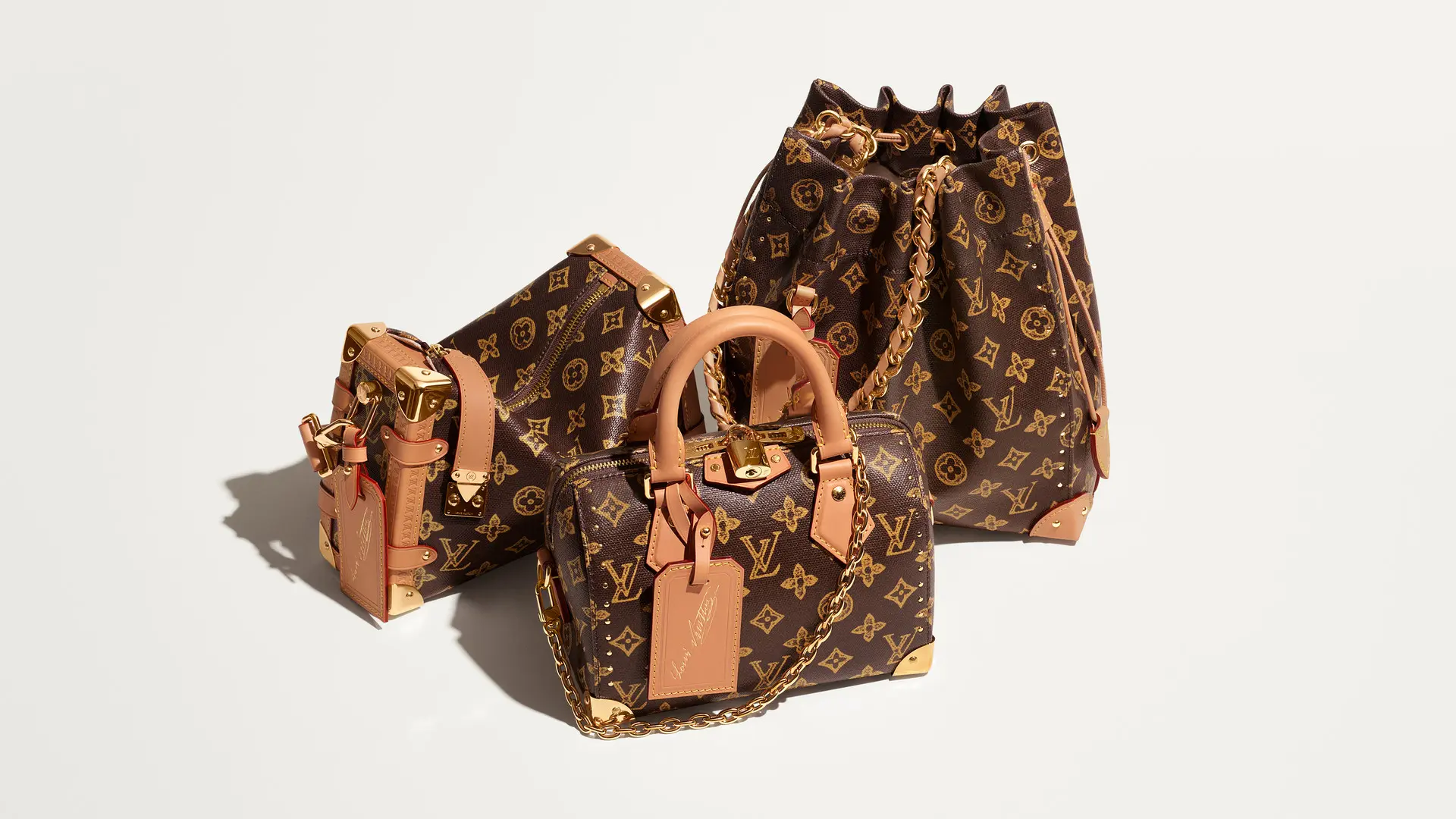
In 1896, Georges Vuitton designed the now-famous Monogram Canvas featuring LV initials, floral motifs, quatrefoils, and geometric flowers. Thought to have been influenced by Japanese decorative motifs popular in Europe at the time, and Victorian ornamentation, the pattern sought to distinguish Louis Vuitton luggage from imitators.
More than a century later, the monogram remains among the world’s most recognizable luxury signatures. Its versatility has allowed it to move effortlessly from trunks to handbags, sneakers, fragrances, furniture, and collaborations with artists like Stephen Sprouse and Yayoi Kusama.
Dior Cannage: Inspired by a Chair
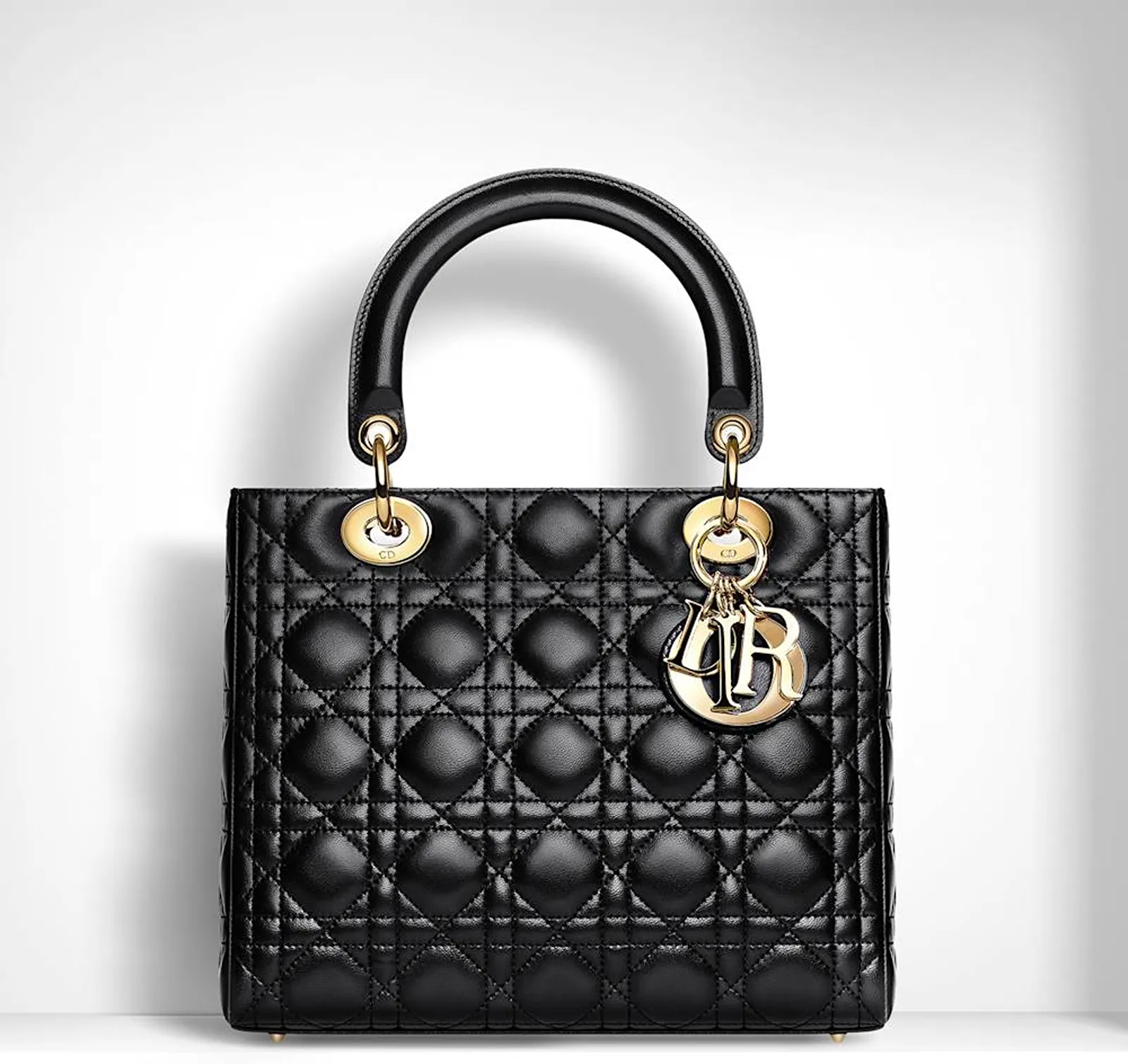
When Christian Dior presented his first couture collection in 1947, guests sat on elegant Napoleon III chairs woven in a distinctive cane pattern.
The pattern became especially famous through the Lady Dior after 1995. Cannage quilting appears most famously on the aforementioned handbag, where meticulous stitching gives the leather its distinctive architectural surface.
Over decades, these colors and patterns have become shorthand for entire histories. In a crowded marketplace where logos compete for attention, the greatest luxuryLuxuryA lifestyle defined by exceptional quality, craftsmanship, exclusivity, and sophistication, encompassing the finest products, services, and experiences that represent the highest standards of refinement and excellence.Go to Luxury Glossary houses discovered the power of instant recognition without words.
FAQs
A luxury house code is a recurring color, pattern, shape, material or motif associated with a particular maison. It communicates the brand’s identity even when its name or logo is absent.
According to a widely repeated account, material shortages during the Second World War led Hermès to use available orange packaging boxes. The maison retained the color, and decades of consistent use made it part of the Hermès identity.
The robin’s-egg blue appeared on the cover of Tiffany & Co.’s first Blue Book in 1845. It subsequently became one of the world’s most recognizable brand colors.
Cartier first used a spotted panther pattern on a wristwatch in 1914. Jeanne Toussaint later developed the animal into a sculptural jewelry motif that became one of the maison’s defining signatures.
Georges Vuitton introduced the Monogram Canvas in 1896 partly to distinguish the maison’s luggage from imitations. Its initials, flowers and quatrefoils have since appeared across fashion, accessories, furniture and artistic collaborations.